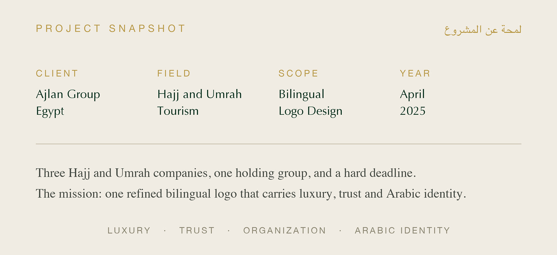
Ajlan Group is an Egyptian holding company operating three Hajj and Umrah companies, serving pilgrims from Economy up to A+ segments.
Each company had its own look, audience, and reputation.
The group had none.
With the Hajj season approaching fast, the business problem was clear:
- fragmented brand equity across three sub-brands,
- no unified visual umbrella to present to partners and pilgrims,
- and a market full of competitors fighting on trust.
The group needed one refined mark that says luxury, organization, and Arabic authenticity at first sight, and it needed it before the season opened.
عجلان جروب شركة قابضة مصرية تدير ثلاث شركات حج وعمرة.
كل شركة كان لها شكلها وجمهورها، لكن المجموعة نفسها لم يكن لها هوية موحدة تقدمها للشركاء والحجاج، في سوق يتنافس على الثقة أولًا.

The brief set a high bar with one reference: Emirates.
Simplicity, luxury, clarity.
Simplicity, luxury, clarity.
My approach was to lead with Arabic calligraphy, not decorate with it.
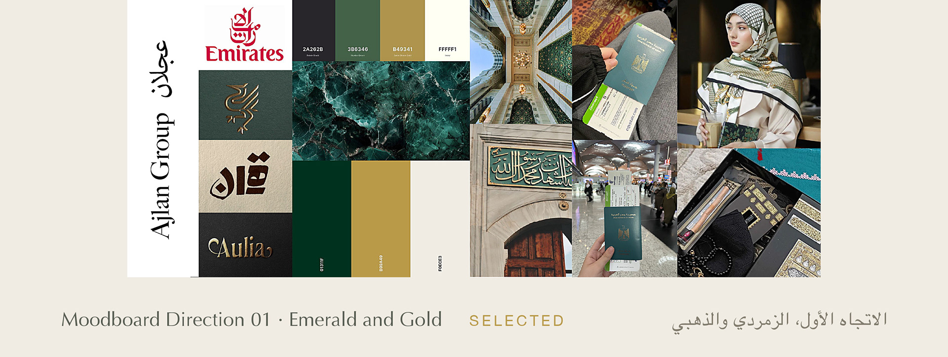
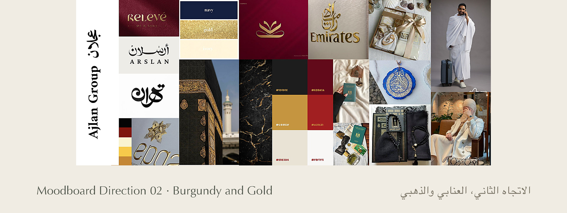
I explored two moodboard directions:
Emerald and Gold, rooted in Islamic architecture, sacred geometry, and emerald marble, and Burgundy and Gold, a more royal, classic route.
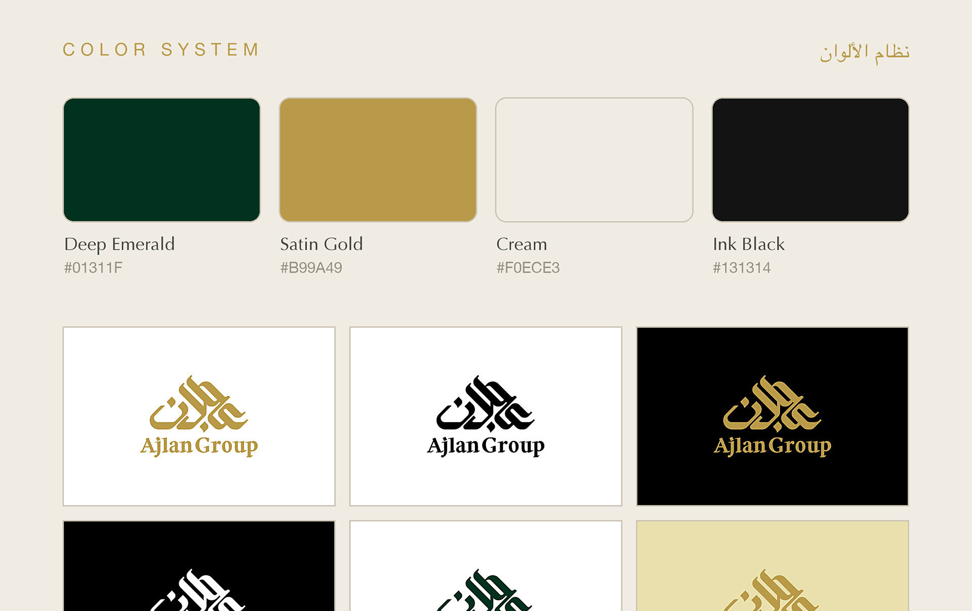
The client and I aligned on the emerald direction: it carried the religious dignity, the luxury, and a color the competition does not own.
قررت: الخط العربي أساس التصميم لا أن يكون زخرفة عليه، واستكشفت اتجاهين في المودبورد، واتفقنا على الاتجاه الزمردي لأنه يحمل الوقار والفخامة معًا، وبلون لا يملكه المنافسون.
Designing bilingual logos is a balancing act, and this one had three hard challenges.
First: the word عجلان in modern Kufic had to feel geometric and organized without losing readability.
Second: the English wordmark had to sit under the Arabic without competing with it, in a serif that matches its dignity.
Third: the whole lockup had to work from a building facade down to a WhatsApp profile picture, in one color or full color, before a tight seasonal deadline.
التحديات: أن تظل كلمة عجلان بالكوفي الحديث مقروءة رغم هندستها وتفردها، وأن تستقر الكلمة الإنجليزية تحت العربية دون أن تنافسها، وأن يعمل الشعار على واجهة مبنى حتى صورة واتساب، قبل موعد نهائي مرتبط بموسم الحج.

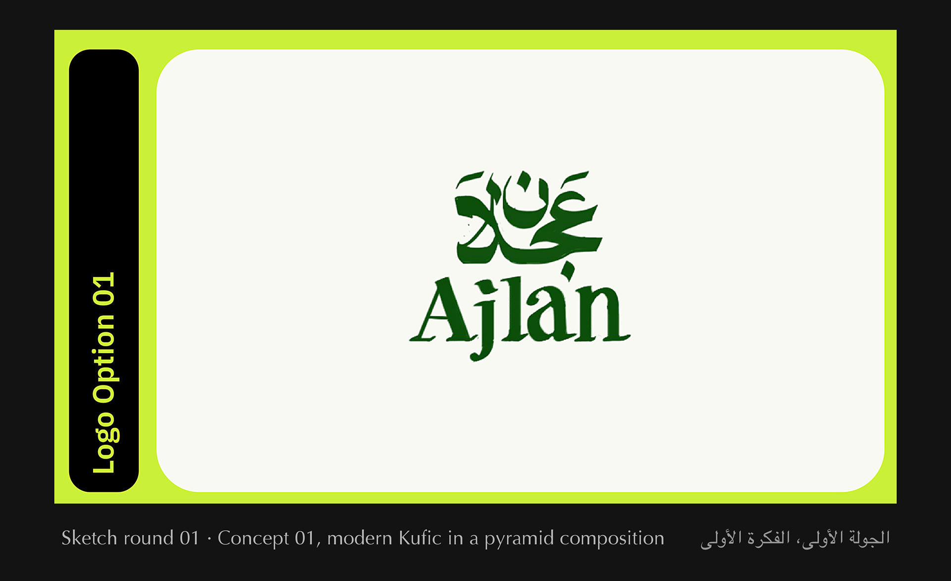
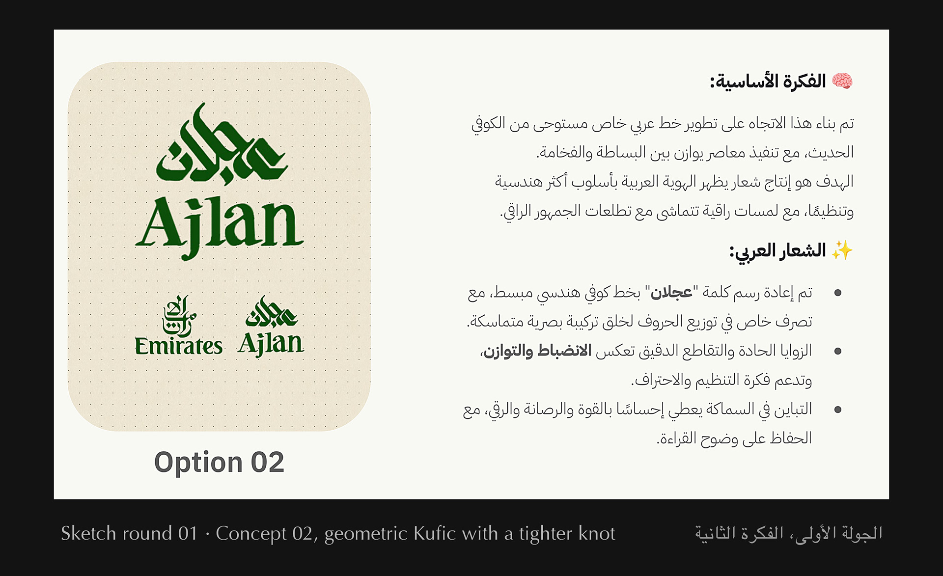
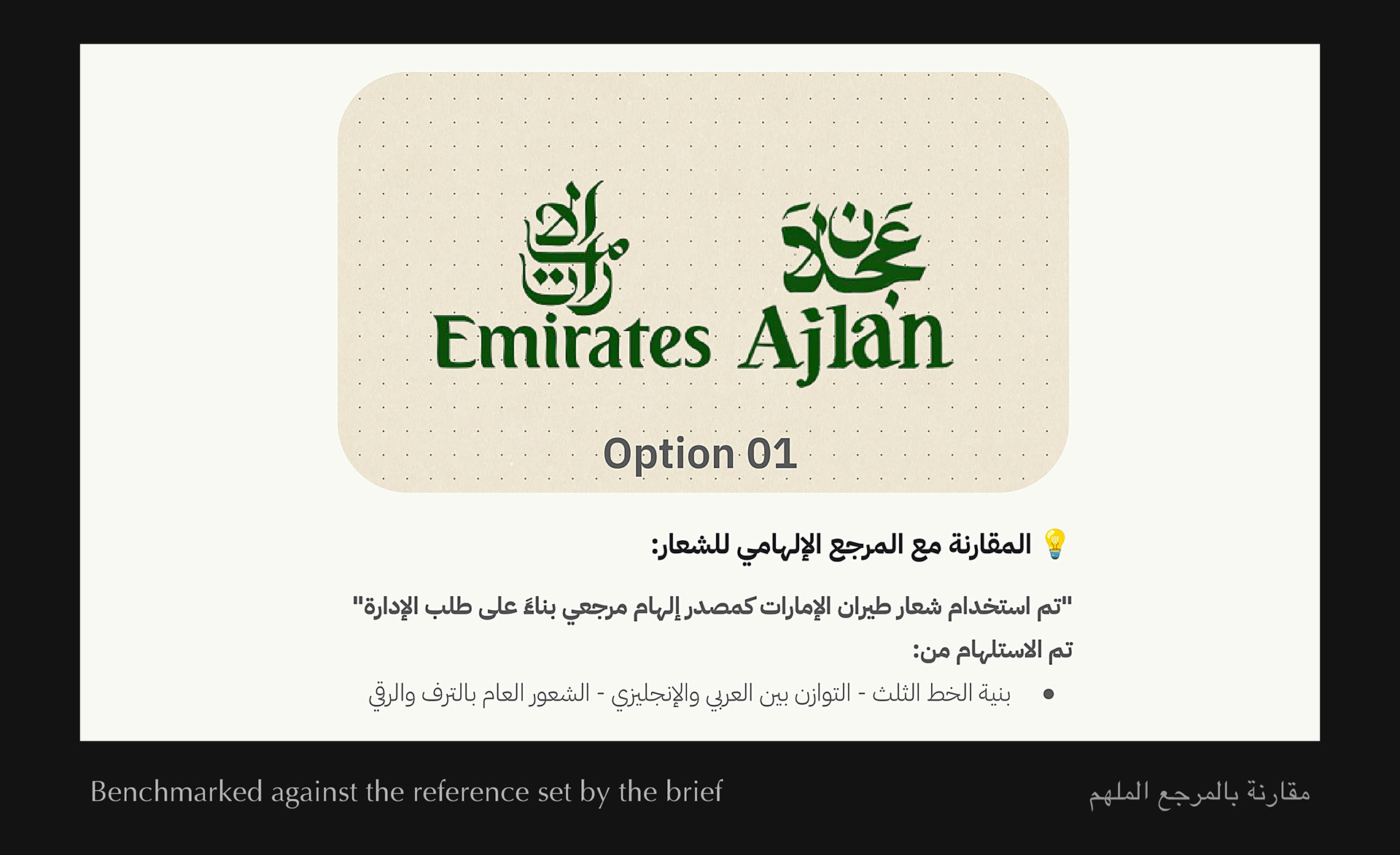
Round one went to the client with two concepts.
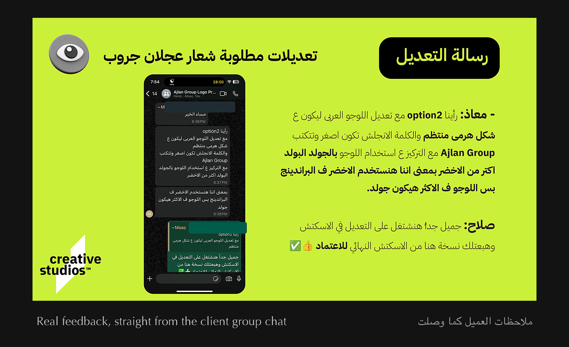
The feedback came back honest and specific, straight in the group chat:
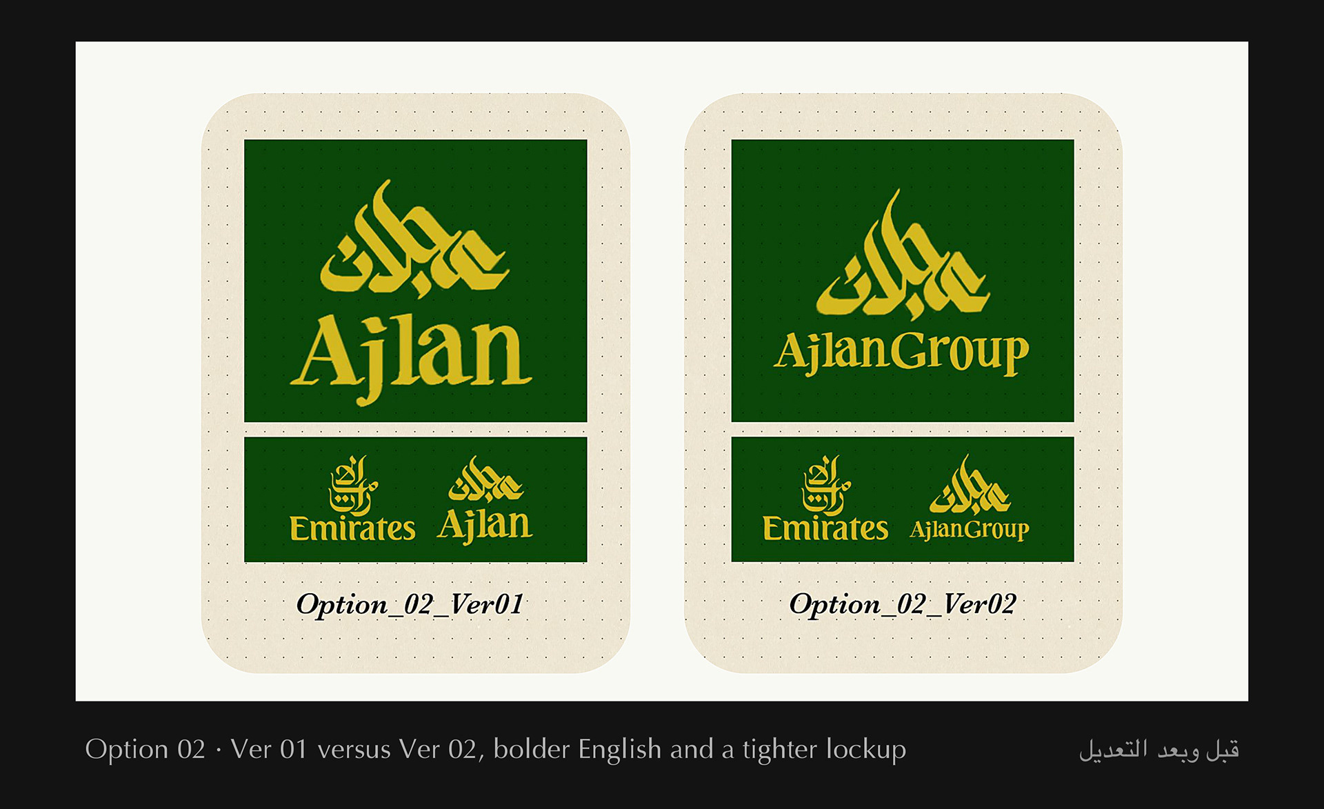
"Make the Arabic mark more pyramid-like and organized, shrink the English and set it as Ajlan Group in bold gold, and lean on green for branding while the logo itself leans gold."
Instead of defending the design, I treated the feedback as a design spec.
Version 02 came back tighter, bolder, and more monumental.
It was approved on the spot.
العميل قال لأ، وكان معه حق. الملاحظات كانت صريحة ومحددة في جروب المشروع، فتعاملت معها كمواصفات تصميم مش كنقد، وخرجت النسخة الثانية أكثر تماسكًا وفخامة واعتُمدت فورًا.

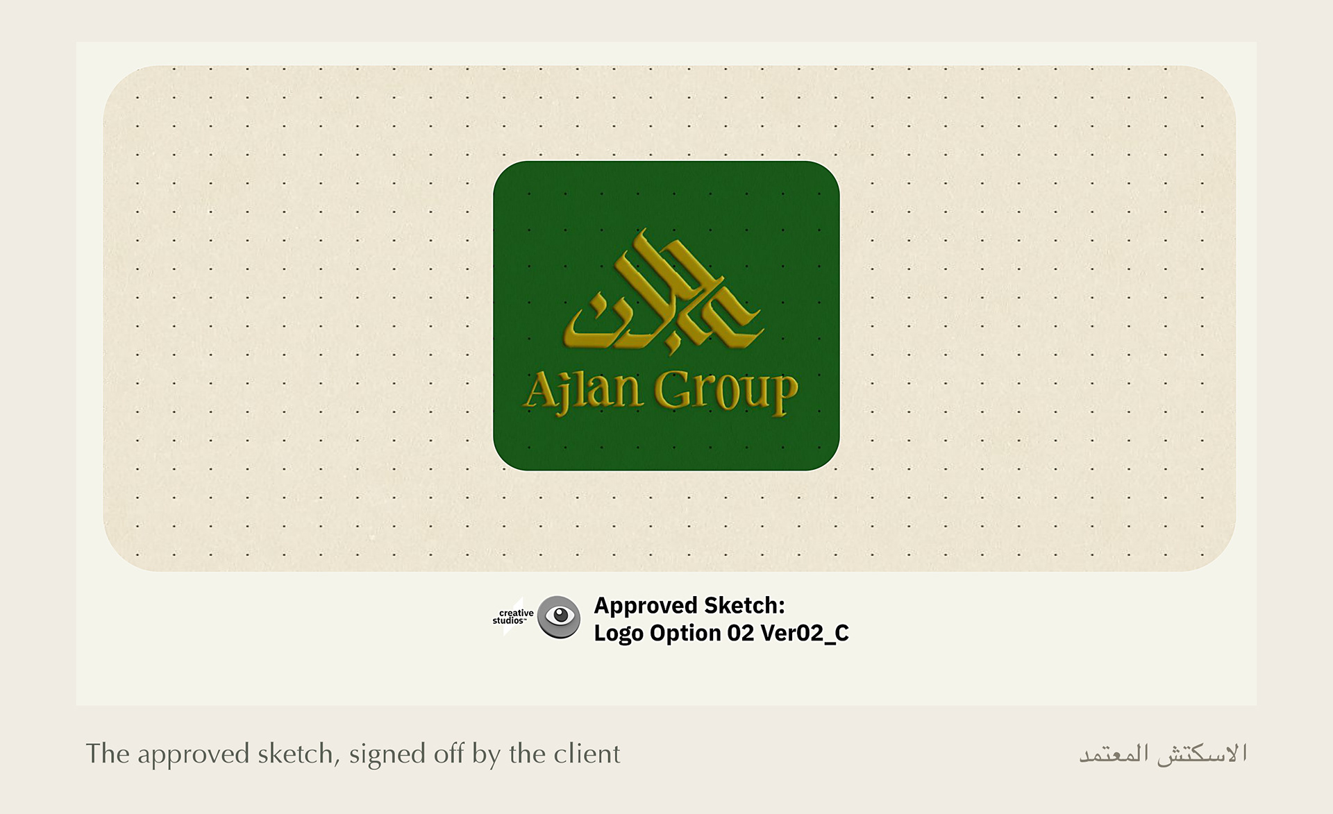
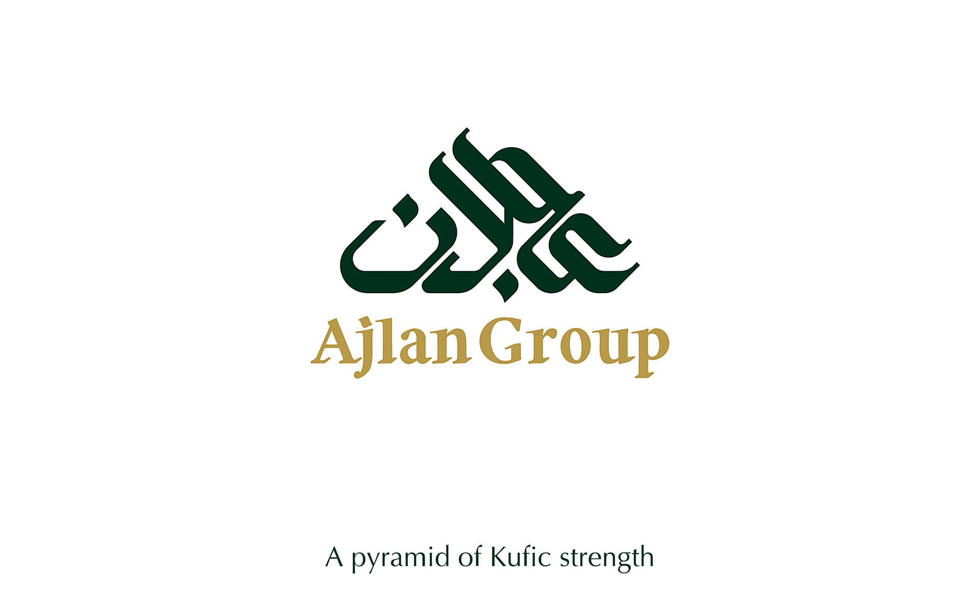
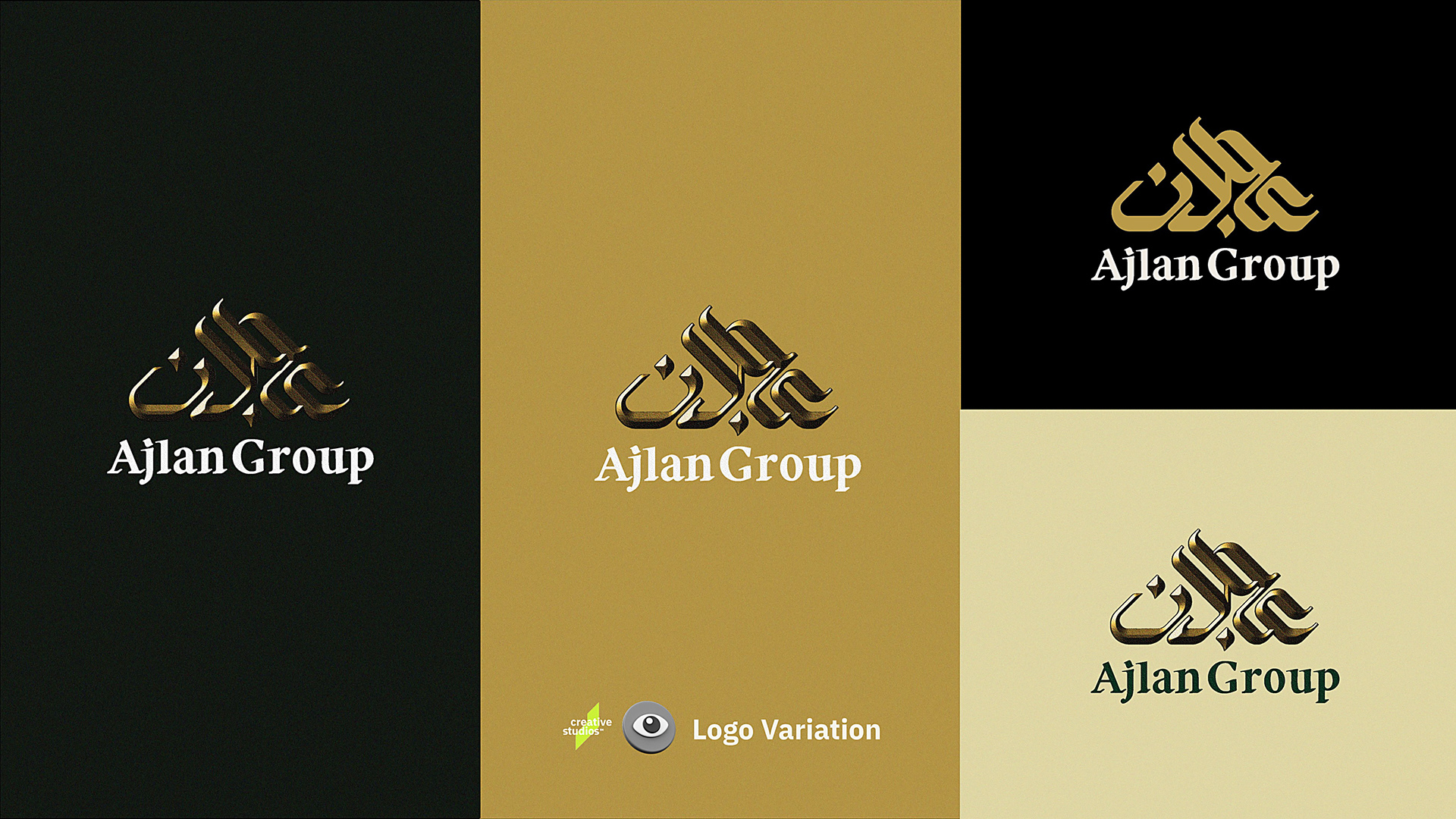
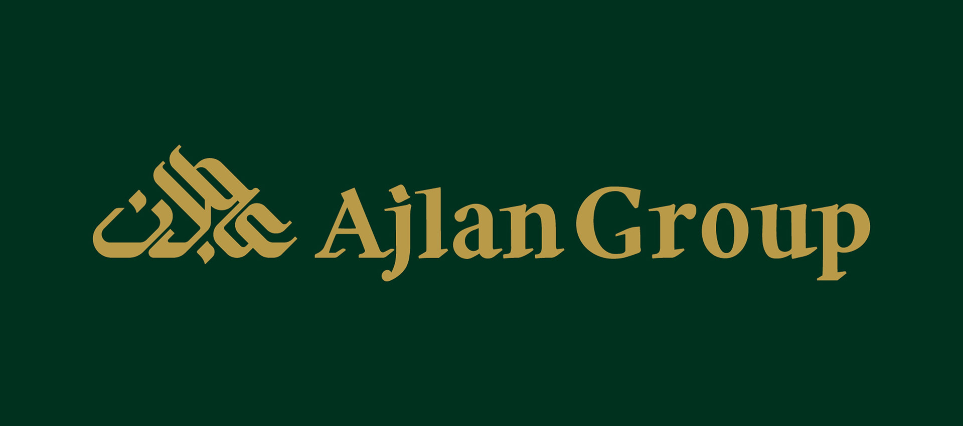
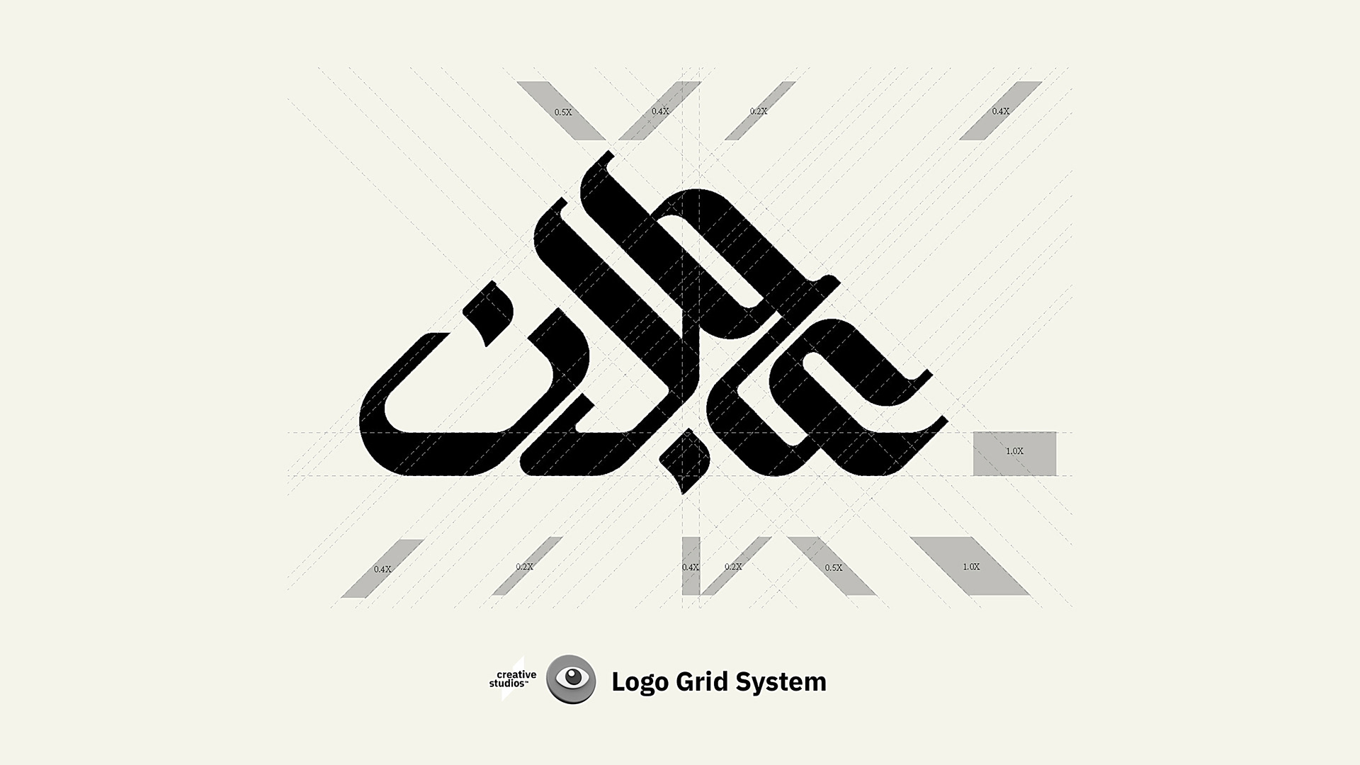
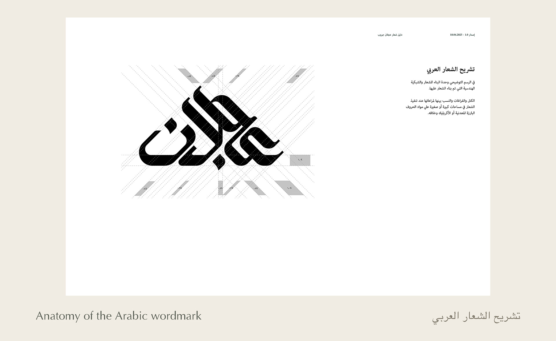
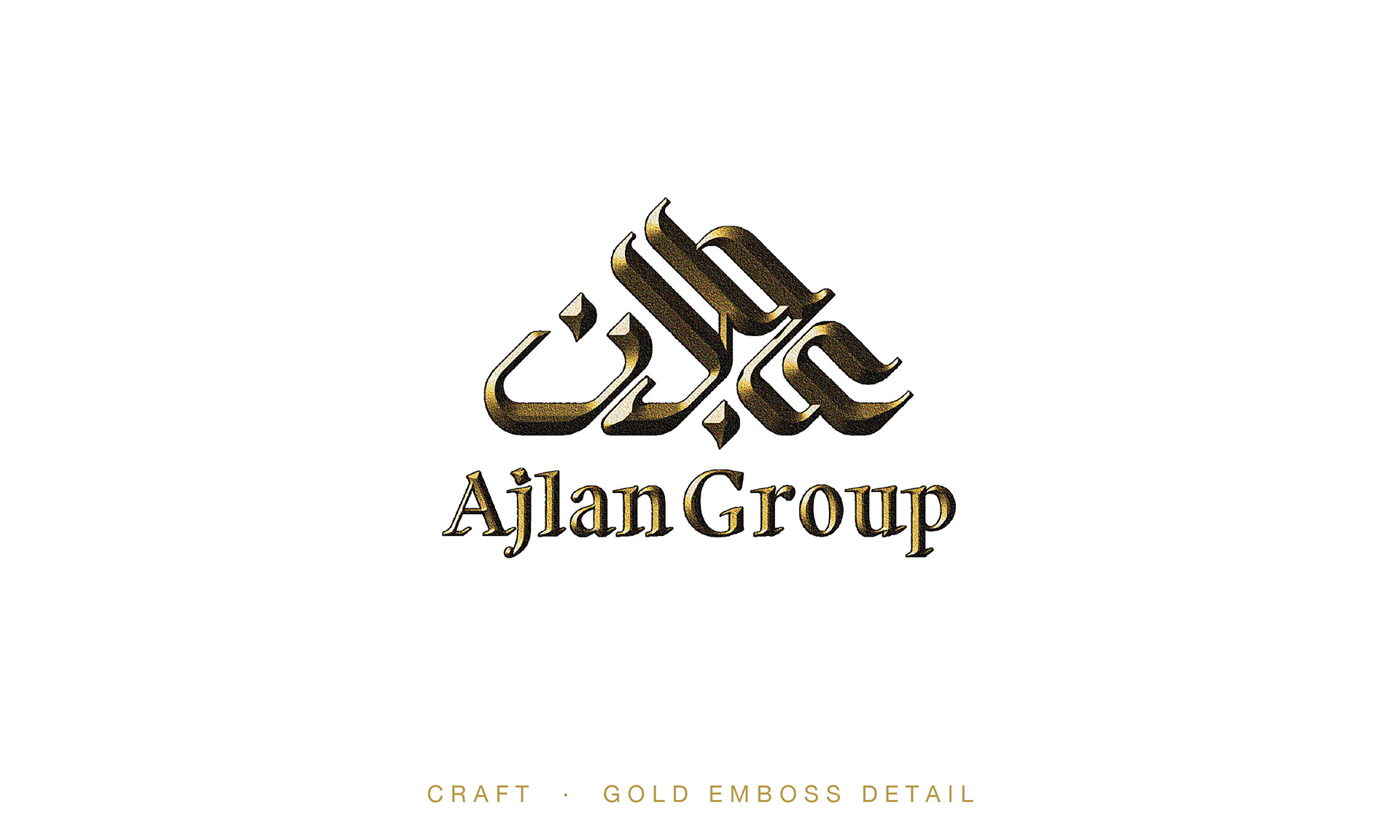
The final mark is a pyramid-shaped Kufic Wordmark reading عجلان
Strength, ascent, and Arabic heritage in one silhouette, over a classic serif Ajlan Group in satin gold.
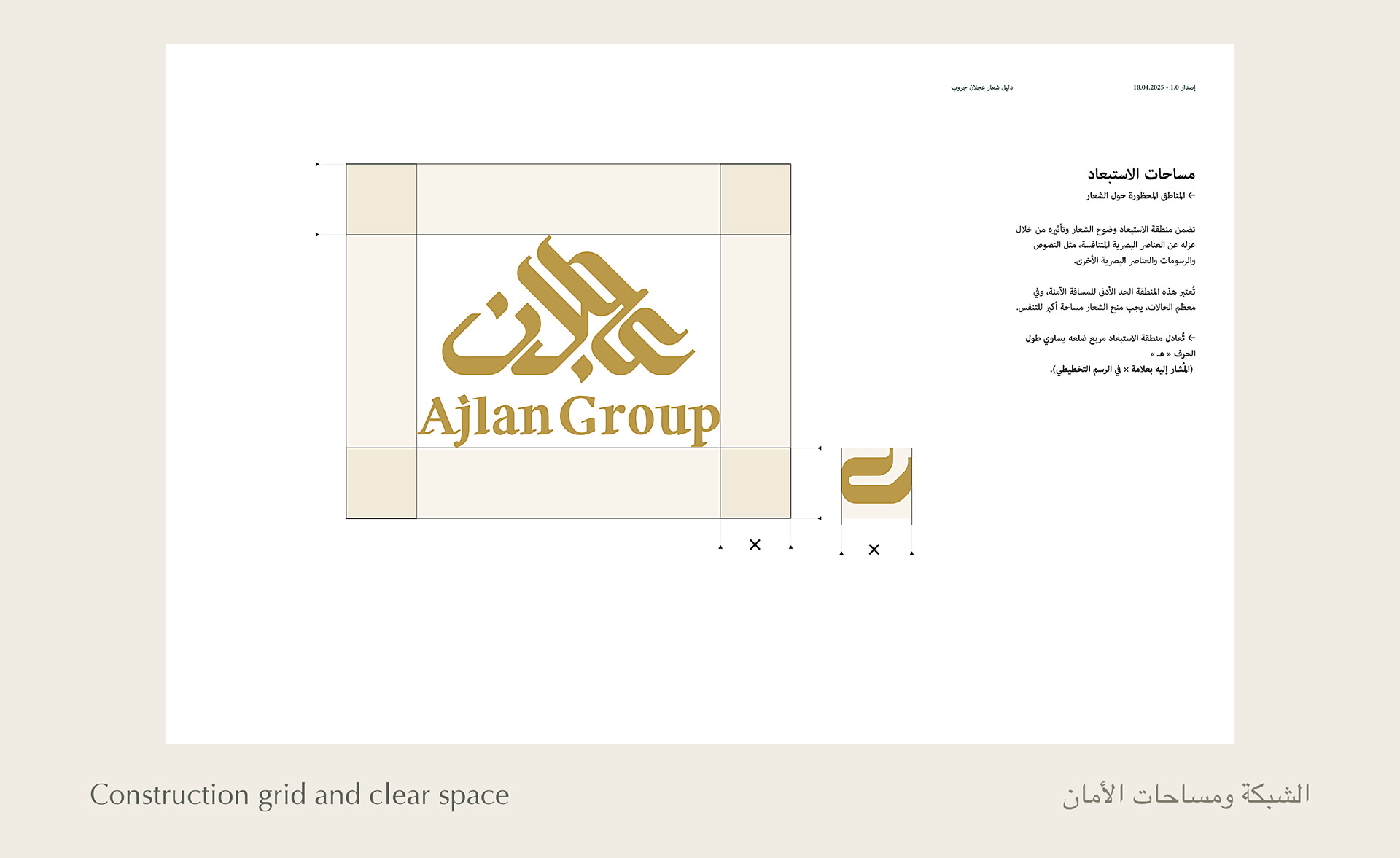
The system ships with horizontal and vertical lockups, full-color, monochrome, and reversed variants; a construction grid; clear-space rules; and placement guidelines, delivered in AI, PDF, PNG, JPG, and SVG, with a full usage guide.
الحل: الشعار النهائي كوفي بتكوين هرمي يُقرأ عجلان، قوة وصعود وهوية عربية في شكل واحد، وأسفله كلمة
Ajlan Group بخط سيريف كلاسيكي، مع كل النسخ والمشتقات ودليل استخدام كامل.

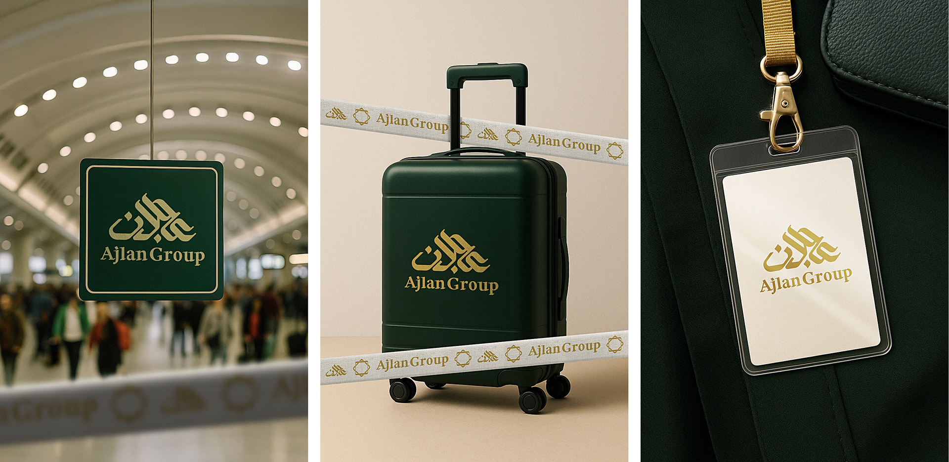
The logo did not stay on paper.
It rolled out across the touchpoints a pilgrim actually meets:
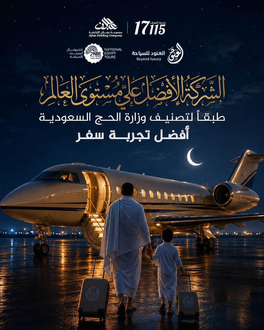
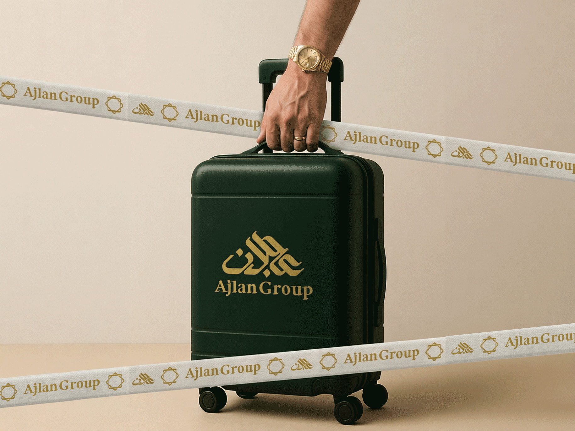
airport signage, branded luggage and luggage straps, staff ID badges and lanyards, uniform scarves woven with the brand pattern, and passport covers with boarding passes.
Every application in deep emerald and satin gold, instantly recognizable in a crowded terminal.
فوراً من الشاشة إلى موسم الحج، الشعار لم يبقى على الورق، بل خرج لنقاط اللقاء الحقيقية مع الحاج، لافتات المطار، الشنط وأحزمتها المطبوعة، بادجات الموظفين، إيشاربات الزي الرسمي بنقشة العلامة، وأغلفة جوازات السفر مع بطاقات الصعود.

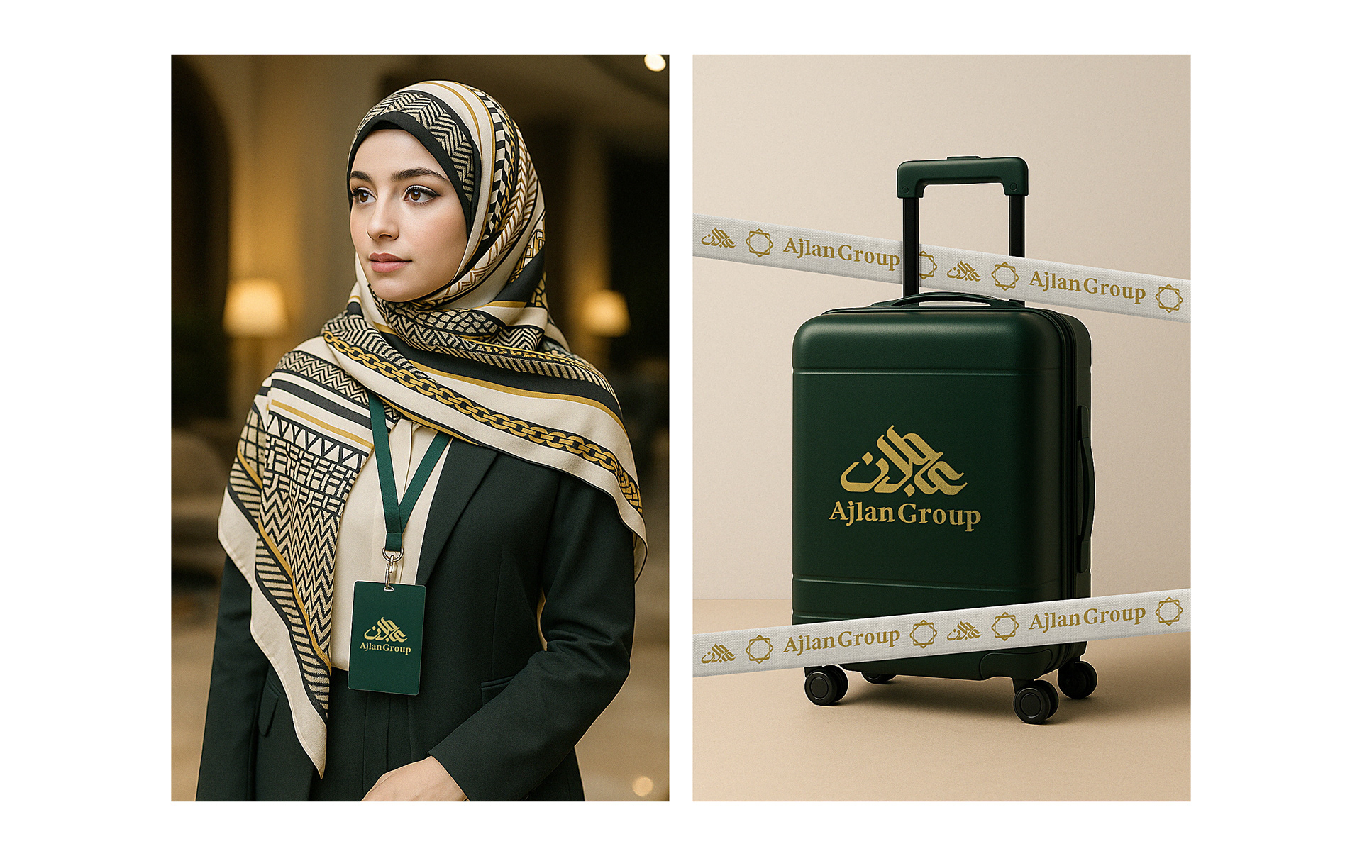
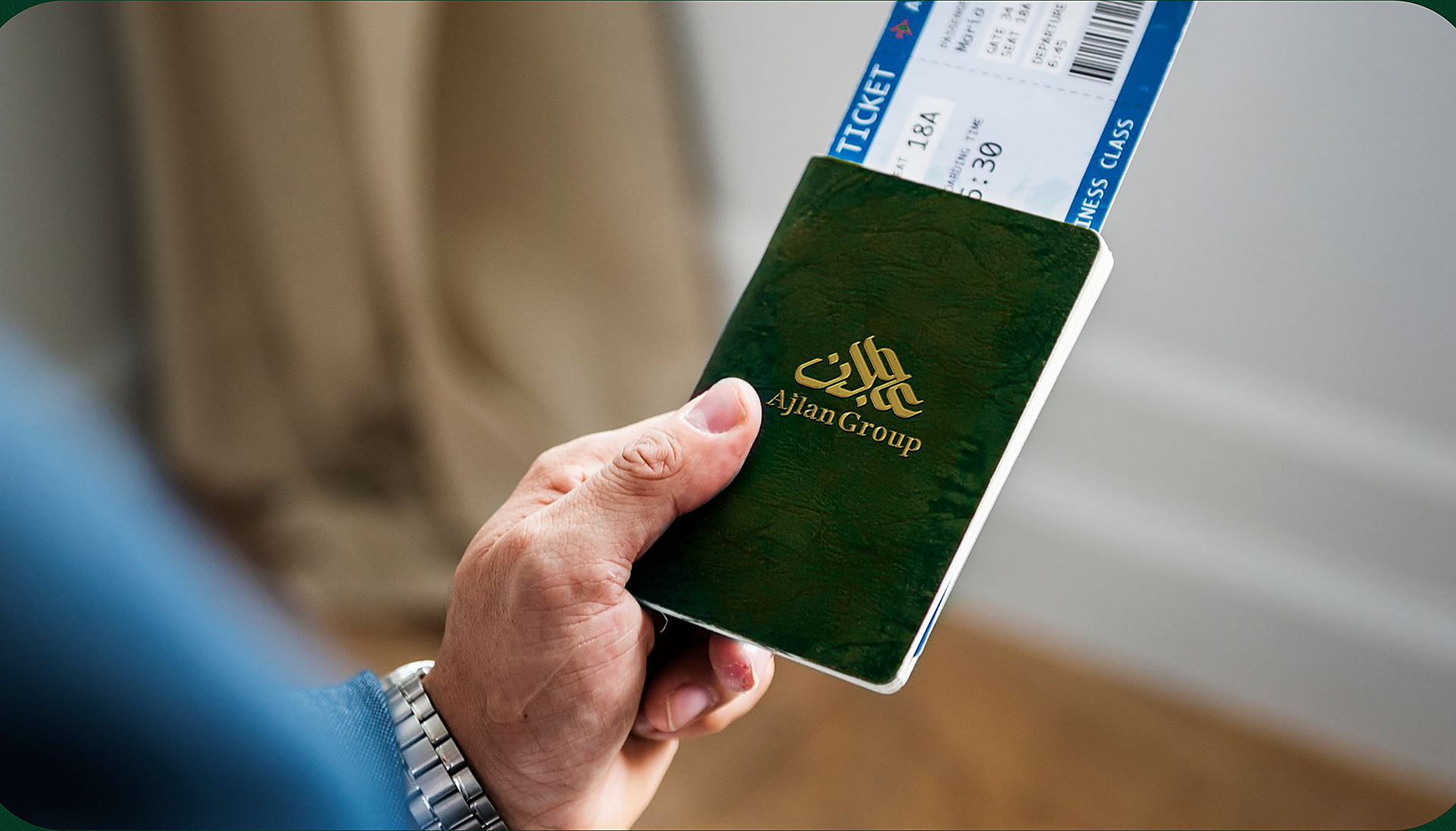
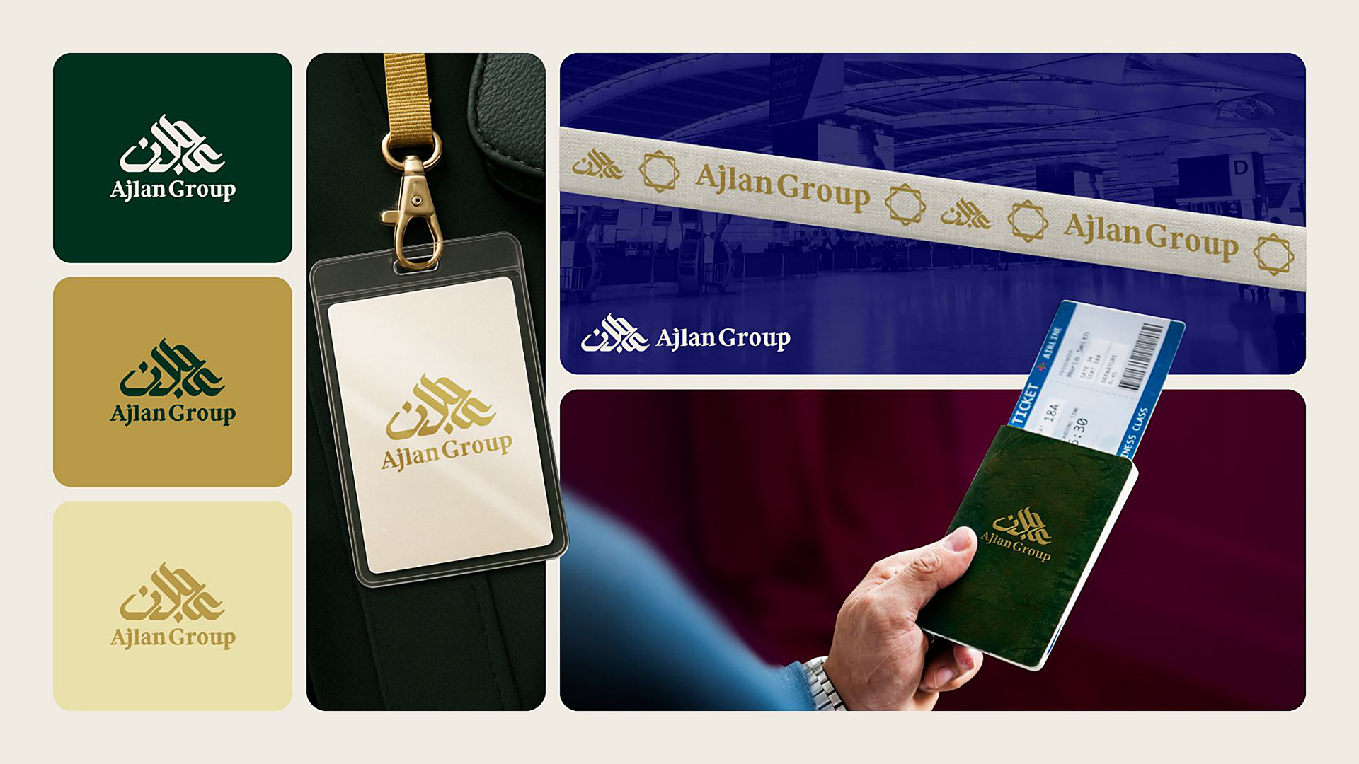
The new logo launched ahead of the Hajj season and became the face of the group
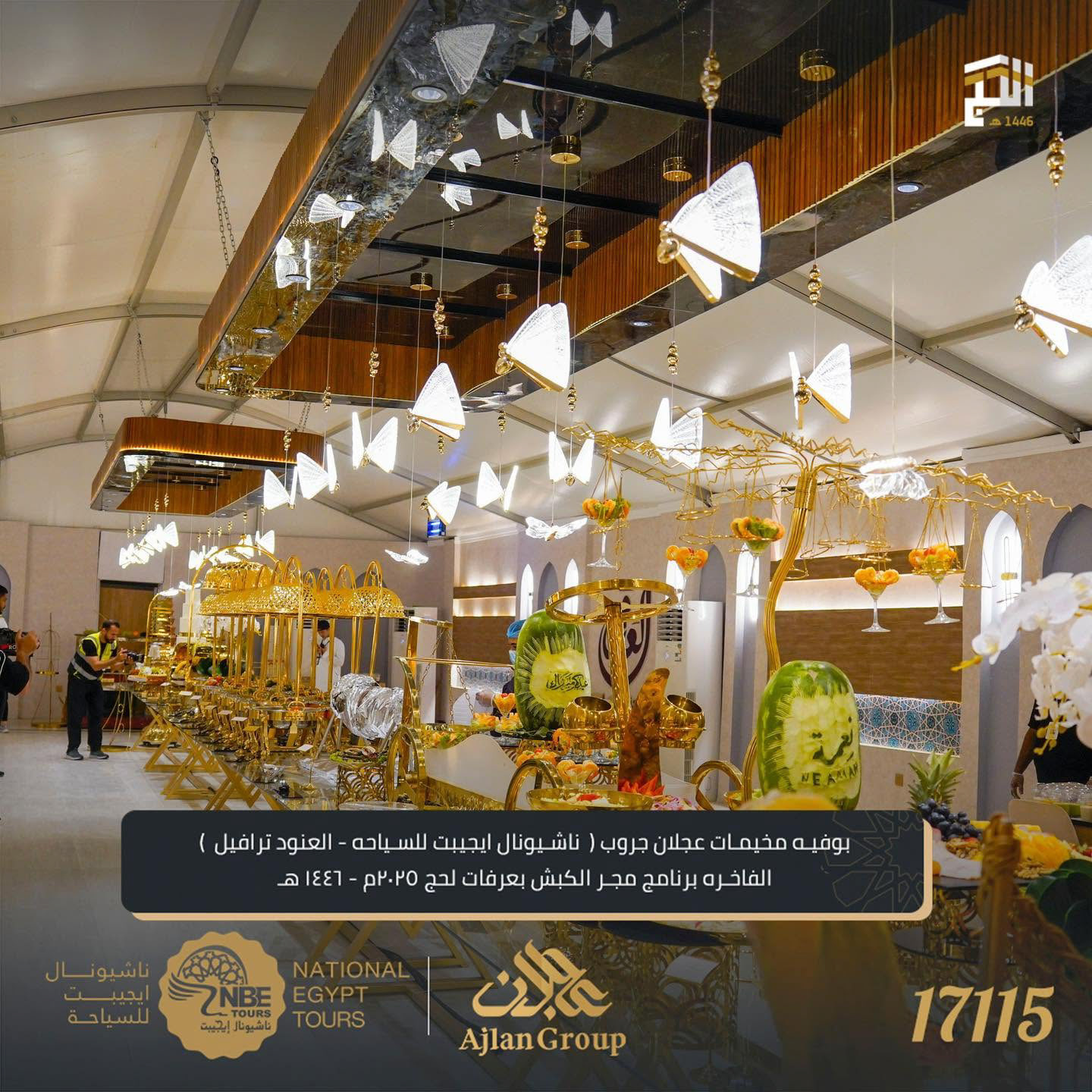
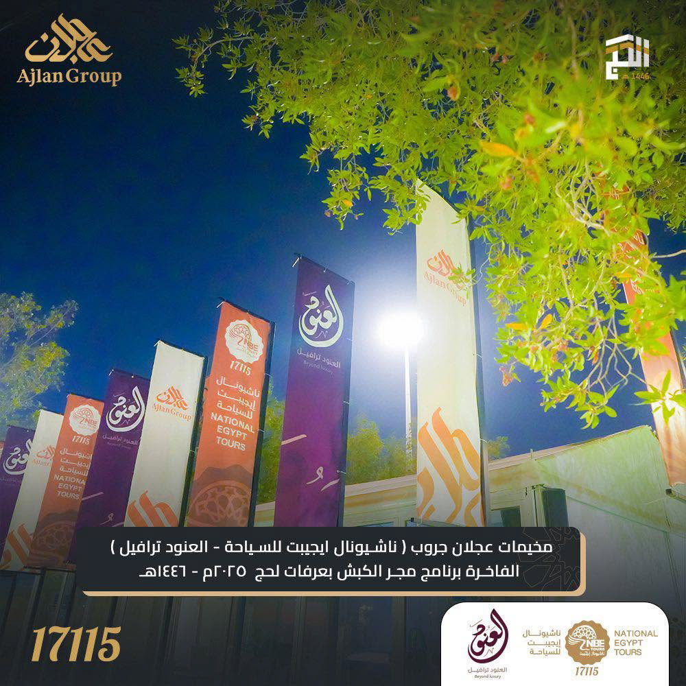
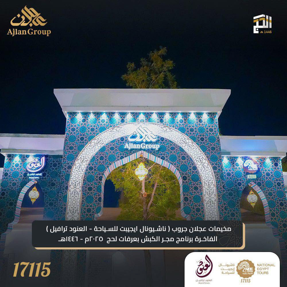
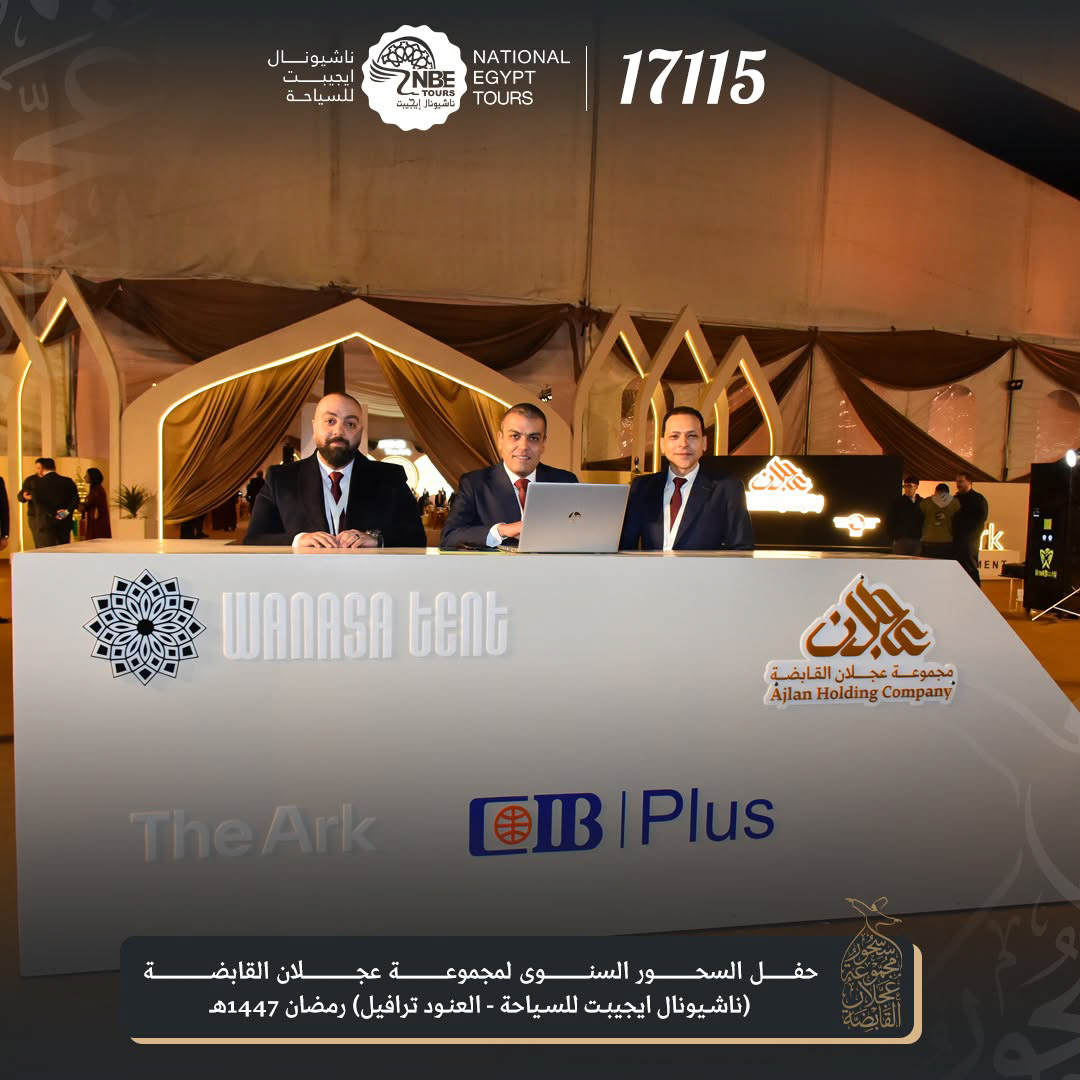
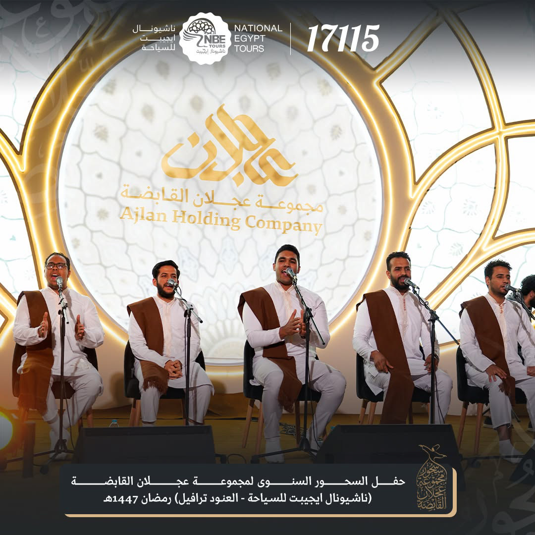
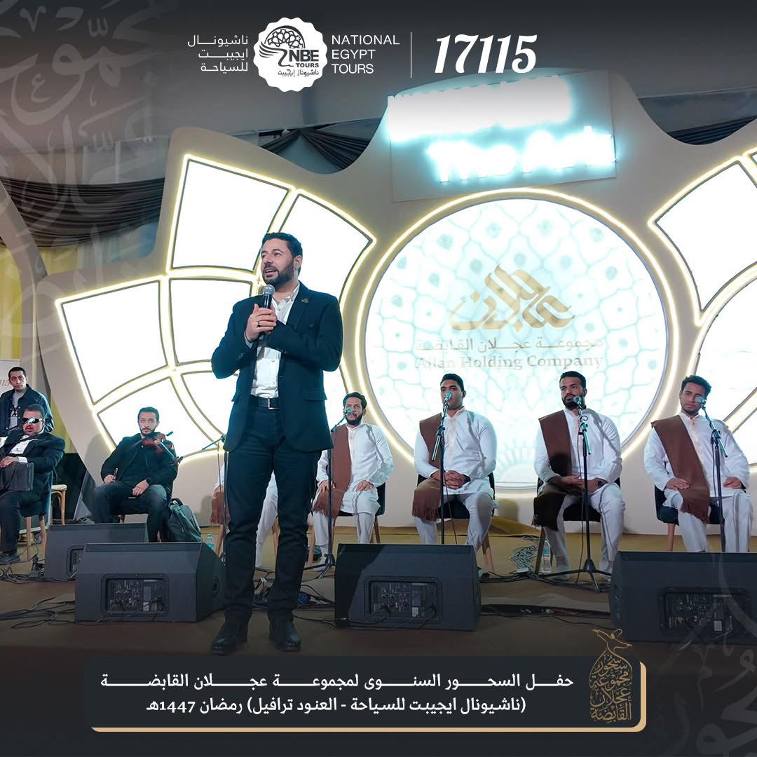
One mark over three companies, used in the group's season launch event and across its partner network, with partnerships spanning major Saudi hospitality names.
The group served over a thousand pilgrims in its first season under the unified brand, presenting one premium face to pilgrims, partners and investors for the first time.
النتيجة، الشعار الجديد انطلق قبل موسم الحج وأصبح وجه المجموعة، علامة واحدة فوق ثلاث شركات، استخدمت في حفل انطلاق موسم الحج وعبر شبكة الشركاء، مع شراكات تشمل أسماء ضيافة سعودية كبرى.
وخدمت المجموعة أكثر من ألف حاج في أول موسم تحت العلامة الموحدة.